22 Best Construction Company Logo Ideas for U.S. Contractors (2026)
In the competitive U.S. construction industry, your company’s logo is more than just a visual symbol. It represents your reputation, professionalism, and the quality of work customers can expect from your business.
Whether you run a general contracting company in Texas, a commercial construction firm in California, or a residential building business in Florida, a well-designed logo helps establish a recognizable brand across your website, work trucks, jobsite signs, uniforms, and marketing materials.
For many American contractors, referrals remain an important source of new business. But even referred customers often research a company online before making contact. A professional, consistent brand identity can reinforce their confidence and help your business make a stronger first impression.
The best construction company logos don’t have to be complicated. Strong typography, recognizable symbols, balanced colors, and thoughtful design can communicate reliability, craftsmanship, and expertise without overwhelming potential customers.
In this guide, we’ve brought together 30 construction company logo ideas for U.S. contractors, covering general contractors, commercial builders, residential construction companies, and specialized construction trades. You’ll discover different logo styles, practical branding tips, and inspiration for creating a visual identity that works across both digital and physical applications.
Whether you’re launching a new construction business or considering a logo redesign, these ideas will help you understand what makes a construction brand look professional, memorable, and ready to compete in the American market.
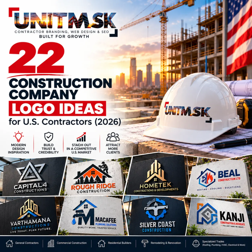
Why Your Construction Logo Matters in 2026
The construction industry has become increasingly competitive.
Customers compare multiple contractors before requesting estimates. They visit websites, Google Business Profiles, LinkedIn pages, Facebook pages, and online reviews.
Your logo helps answer an important question:
“Does this company look trustworthy?”
A strong logo can improve:
- Brand recognition
- Customer trust
- Professional image
- Marketing consistency
- Vehicle branding
- Yard signs
- Website conversions
- Social media engagement
A professional logo is only one part of a complete construction identity. For a broader look at building a consistent brand across visual identity, messaging and marketing materials,
See our construction branding guide for U.S. contractors to learn how construction companies can create a consistent identity across websites, vehicles, signage and marketing materials.
What Makes a Great Construction Logo?
The best contractor logos are:
- Simple
- Easy to recognize
- Professional
- Scalable
- Timeless
- Easy to print
- Readable from a distance
They should look equally good on:
- Pickup trucks
- Construction trailers
- Hard hats
- Safety vests
- Business cards
- Websites
- Social media
- Job site banners
- Equipment decals
For additional examples focused on professional contractor branding, see our 30 Roofing Company Logo Ideas for U.S. Contractors (2026)
22 Commercial Construction Logo Ideas for U.S. Contractors
A U.S. construction company logo should communicate trust, safety, and professionalism while reflecting the standards expected by American clients.
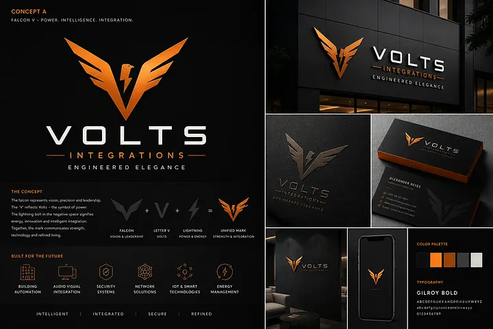
1. VOLTS Integrations – Modern Falcon-Inspired Logo Design
The VOLTS Integrations logo combines a sharp falcon-inspired symbol with a lightning bolt and modern typography to communicate power, precision, and advanced technology. Its metallic orange and black color palette creates a bold, premium appearance suitable for technical service businesses.
For U.S. electrical contractors, building automation specialists, smart building integrators, and commercial technology companies, this style demonstrates how a distinctive symbol can represent multiple services without relying on traditional construction imagery.
The compact emblem is particularly useful for embroidered uniforms, service vehicles, building signage, and digital branding.
Design Inspiration: Abstract falcon symbol, lightning bolt integration, geometric lettering, and a high-contrast industrial color palette.
Best For: Electrical contractors, smart building technology companies, commercial automation specialists, and low-voltage integration businesses.
2. GSK Construction Ltd. – Bold Orange and Gray Construction Logo
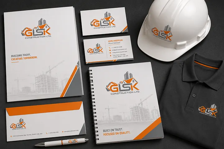
The GSK Construction logo combines bold geometric lettering with an architectural skyline and roof-inspired elements. Its orange, gray, and white color palette communicates energy, structural strength, and a professional construction identity.
For U.S. general contractors and commercial construction companies, this design offers inspiration for integrating recognizable building elements directly into a company’s initials. The result is a compact identity that can work across business cards, hard hats, uniforms, letterheads, and construction equipment.
The strong orange accents help distinguish the logo against neutral backgrounds, while the architectural details reinforce its connection to the building industry.
Design Inspiration: Architectural monogram, building silhouettes, geometric typography, and orange-gray contrast.
Best For: General contractors, commercial builders, construction management firms, and residential construction companies.
Does Your Construction Logo Look as Professional as Your Work?
Your logo may be the first thing a homeowner sees on your truck, website, estimate, yard sign, or Google profile. A generic or outdated identity can make an established roofing company look less credible than it really is.
Unitmask helps U.S. contractors build professional brand identities designed to look consistent, recognizable, and established across every customer touchpoint.
3. JJ Constructions – Creative Lettermark Logo with Architectural Elements
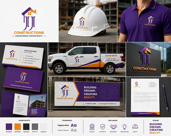
The JJJ Constructions logo showcases a distinctive combination of stylized letterforms and architectural elements, creating a memorable visual identity for construction businesses. The three elongated “J” letters form a recognizable monogram, while the roof-inspired symbol reinforces the company’s connection to residential and commercial building projects.
The purple and orange color combination offers a refreshing alternative to the traditional blue, black, and red palettes commonly associated with construction branding. Purple creates a distinctive premium appearance, while orange adds energy and visual contrast.
For U.S. general contractors, custom home builders, and residential construction companies, this design demonstrates how a creative lettermark can establish brand recognition without relying on overly detailed construction illustrations.
The logo’s vertical structure works particularly well on hard hats, embroidered polo shirts, business cards, contractor websites, and building signage. Its consistent application across branded vehicles and marketing materials also illustrates the value of a cohesive construction brand identity.
Design Inspiration: Custom JJ lettermark, architectural roof symbol, elongated typography, and contrasting purple-orange colors.
Best For: U.S. general contractors, custom home builders, residential construction companies, and design-build firms.
Branding Tip: Contractors with short or initial-based business names can use custom letterforms to create a distinctive identity. Make sure the monogram remains readable at smaller sizes, especially on uniforms, vehicle graphics, and mobile screens.
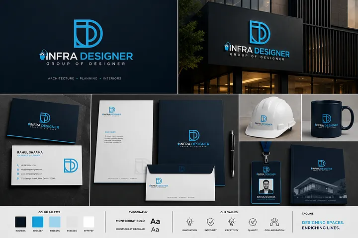
4. Infra Designer – Modern Architectural Monogram Logo Design
The Infra Designer logo features a clean, geometric monogram that combines architectural precision with modern brand identity design. Its interlocking blue letterforms create a distinctive visual symbol, while the dark navy background and minimalist typography communicate sophistication and professionalism.
For U.S. architecture firms, design-build contractors, commercial construction consultants, and interior design businesses, this logo style demonstrates how a simple monogram can establish a premium visual identity without relying on traditional construction tools or building illustrations.
The bright blue and navy color combination provides strong contrast across architectural signage, business cards, presentation folders, and digital platforms. Its compact symbol also makes it suitable for contractor websites, project proposals, and branded merchandise.
Design Inspiration: Geometric lettermark, architectural symmetry, minimalist typography, and blue-on-navy branding.
Best For: U.S. architecture firms, design-build companies, commercial construction consultants, and architectural design studios.
Branding Tip: Architecture and design-build businesses can use a distinctive monogram to communicate precision and sophistication. Keep the symbol recognizable at smaller sizes for website headers, social media profiles, and architectural drawings.
A distinctive architectural logo is only one part of building a recognizable construction brand. For U.S. design-build firms and architectural contractors, consistent typography, colors, project presentations, and marketing materials help create a professional identity across every customer touchpoint. Explore how a complete contractor branding strategy can bring these elements together.
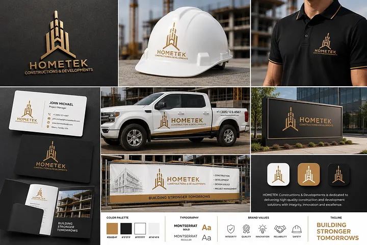
5. Hometek – Premium Gold Architectural Logo for Luxury Home Builders
The Hometek Constructions & Developments logo uses a gold architectural symbol inspired by modern high-rise structures. Its vertical geometric lines create an elegant building silhouette, giving the brand a sophisticated appearance suited to premium construction and property development.
The combination of metallic gold, black, and white establishes a refined visual identity. For U.S. luxury home builders, commercial developers, and high-end residential construction firms, this style demonstrates how architectural geometry and restrained colors can create a premium brand presentation.
The logo is showcased across hard hats, contractor uniforms, company vehicles, office signage, and stationery. Its consistent application illustrates how a unified brand identity can support a professional appearance across client meetings, construction sites, and marketing materials.
Design Inspiration: Gold architectural emblem, vertical building geometry, minimalist typography, and luxury-inspired color combinations.
Best For: U.S. luxury home builders, real estate developers, commercial construction firms, and high-end residential contractors.
Branding Tip: Premium construction brands can use metallic accents to create a distinctive appearance, but should also maintain a simplified, single-color logo version for embroidery, vehicle graphics, and everyday business applications.
For luxury home builders and construction developers, premium branding should extend beyond the company logo. A well-designed website featuring completed projects, high-quality photography, and clear service information can help prospective clients evaluate the builder’s capabilities. Discover how professional contractor website design can support a consistent brand experience from the first online visit to the initial consultation.
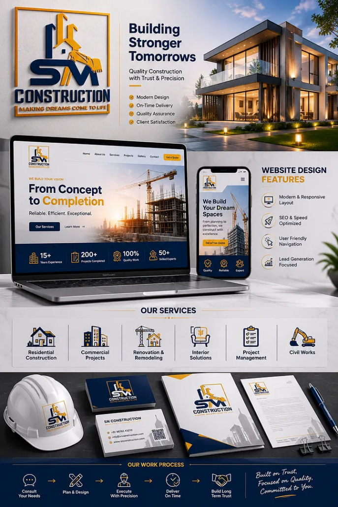
6. SM Construction – Bold Construction Logo with Integrated Equipment Symbol
The SM Construction logo combines bold initials, architectural elements, and a construction equipment illustration to create an energetic visual identity. Its navy blue and golden-yellow color palette emphasizes strength, reliability, and an active connection to the construction industry.
Unlike minimalist construction logos, this concept uses recognizable industry imagery to communicate the company’s services. The integration of construction equipment and building elements makes it particularly relevant for U.S. general contractors, residential builders, remodeling companies, and construction businesses offering multiple services.
The branding presentation also demonstrates how a consistent visual identity can extend beyond the logo into a responsive construction website, service icons, hard hats, business cards, and marketing materials.
For contractors serving competitive local markets, a recognizable logo paired with a clear website can help potential customers understand the business and explore its services.
Design Inspiration: Bold lettermark, construction equipment illustration, architectural elements, and navy-gold color contrast.
Best For: U.S. general contractors, residential builders, remodeling companies, and construction service providers.
Branding Tip: Construction businesses using detailed equipment illustrations should create a simplified version of their logo for smaller applications. This helps preserve readability on mobile websites, uniforms, hard hats, and vehicle decals.
A bold construction logo can make a company recognizable, but potential customers also need a clear way to explore its services and previous work. For U.S. general contractors and remodeling businesses, a mobile-friendly website with project galleries, service-area information, and accessible estimate requests can turn that initial brand impression into meaningful inquiries. Learn more about construction website design built for lead generation.
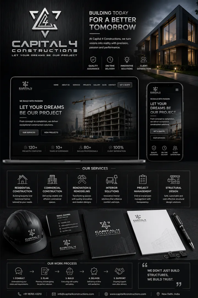
7. Capital 4 Constructions – Modern Geometric Logo for General Contractors
The Capital 4 Constructions logo features a distinctive geometric monogram that combines angular shapes with a metallic silver finish. Set against a deep black background, the design creates a bold, contemporary identity that communicates precision, structural strength, and professionalism.
For U.S. general contractors, commercial builders, and modern residential construction firms, this style demonstrates how a strong abstract symbol can create brand recognition without relying on traditional construction equipment illustrations.
The monochromatic color palette works particularly well for companies targeting premium residential developments, commercial construction projects, and design-build services. The logo’s angular structure also complements modern architectural photography and minimalist website layouts.
The branding presentation extends the identity across a responsive contractor website, business cards, hard hats, and stationery, demonstrating how a consistent visual system can connect offline branding with digital marketing.
Design Inspiration: Geometric monogram, metallic silver typography, angular architectural shapes, and minimalist black-and-white branding.
Best For: U.S. general contractors, commercial construction companies, design-build firms, and premium residential builders.
Branding Tip: Abstract construction logos should remain recognizable without metallic effects. A simplified flat-color version helps maintain clarity on embroidered uniforms, vehicle graphics, and smaller digital applications.
A modern construction logo creates a strong first impression, but the same visual consistency should continue across the company’s online presence. For U.S. general contractors and commercial builders, a well-structured website featuring completed projects, clear service information, and accessible estimate requests can strengthen that brand experience. Explore how professional contractor website design brings branding and lead generation together.
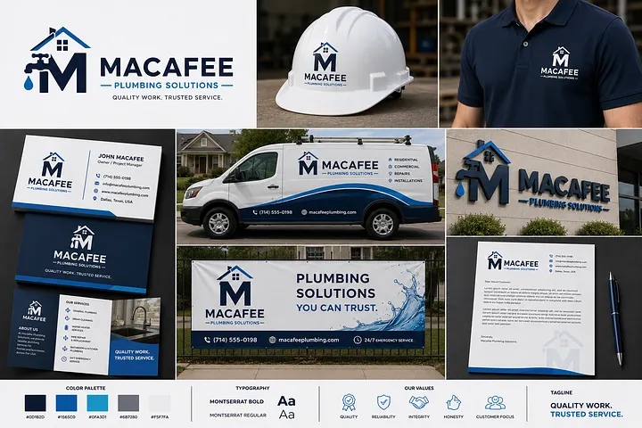
8. Macafee Plumbing Solutions – Creative Plumbing Logo with House and Water Symbols
The Macafee Plumbing Solutions logo combines a bold letter “M” with a residential roofline, plumbing fixtures, and a water droplet. This integrated design immediately communicates the company’s connection to plumbing services while maintaining a professional and recognizable visual identity.
The navy blue and bright blue color palette reflects water, reliability, and technical expertise. Its clean typography and balanced composition make the logo suitable for U.S. residential plumbing contractors, emergency plumbing services, and plumbing installation businesses.
One of the strongest aspects of this branding concept is its practical application. The logo appears consistently across service vans, uniforms, hard hats, business cards, and outdoor signage—important touchpoints for plumbing companies serving local homeowners.
For U.S. plumbing businesses competing in markets such as Dallas, Houston, Phoenix, or Atlanta, a recognizable vehicle graphic and consistent branding can help reinforce familiarity within their service areas.
Design Inspiration: Custom lettermark, residential roofline, plumbing fixture illustration, water droplet, and blue color palette.
Best For: U.S. residential plumbers, plumbing repair companies, emergency plumbing contractors, and plumbing installation businesses.
Branding Tip: Plumbing company logos should remain easy to recognize on moving service vehicles and at smaller sizes. Avoid excessive details that become difficult to distinguish on uniforms, mobile websites, or Google Business Profile images.
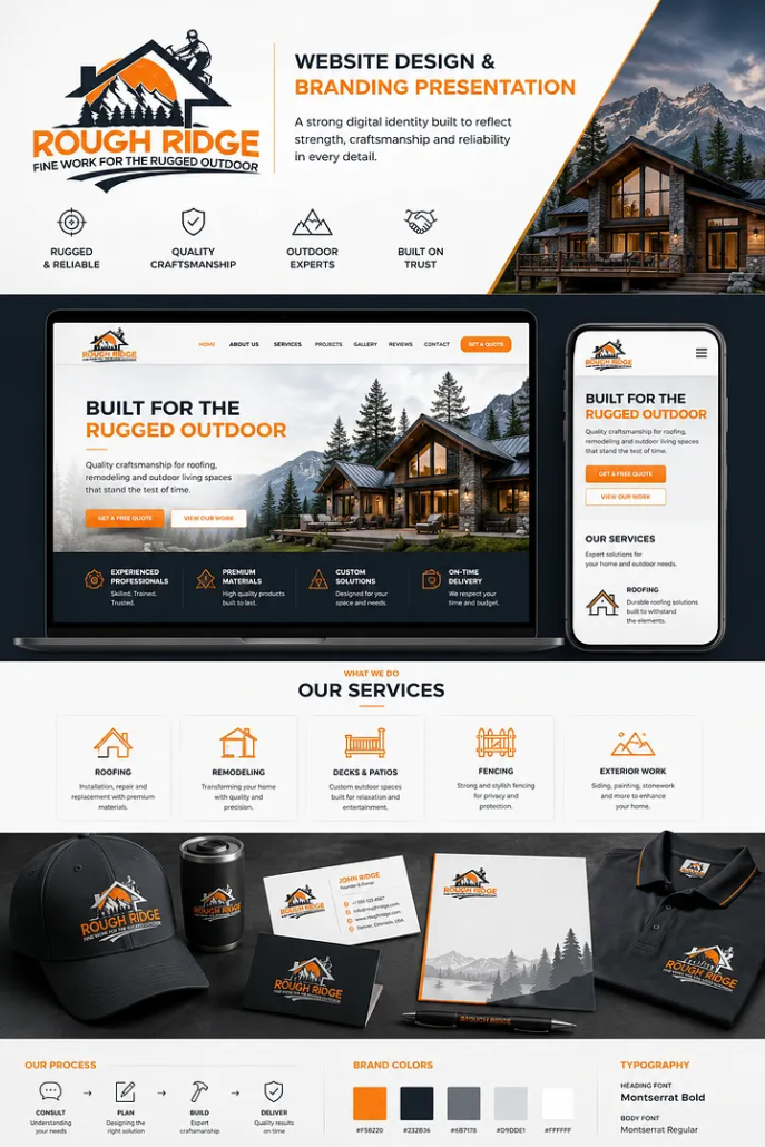
9. Rough Ridge – Outdoor-Inspired Logo for Roofing and Remodeling Contractors
The Rough Ridge logo combines a mountain landscape, residential roofline, pine trees, and a construction worker silhouette to create a distinctive identity inspired by rugged outdoor craftsmanship.
Its orange, black, and white color palette communicates energy, durability, and confidence. Unlike conventional roofing logos that rely primarily on roof shapes, this concept incorporates natural scenery to establish a stronger connection with outdoor construction and mountain-style residential projects.
For U.S. roofing contractors, exterior remodeling companies, cabin builders, and residential construction businesses operating in regions such as Colorado, Montana, Idaho, and Wyoming, this design style offers inspiration for creating a brand that reflects the environment and type of projects they specialize in.
The branding presentation demonstrates how the identity can extend across a contractor website, service descriptions, branded apparel, business cards, and promotional materials. The consistent use of colors and imagery creates a cohesive visual experience.
Design Inspiration: Mountain silhouette, residential roofline, pine trees, construction worker illustration, and orange-black contrast.
Best For: U.S. roofing contractors, exterior remodeling companies, custom cabin builders, and residential construction businesses.
Branding Tip: Location-inspired logos can help communicate a contractor’s specialization, but detailed illustrations should be simplified for smaller applications. A secondary logo mark can improve readability on hard hats, embroidered clothing, and mobile screens.
Roofing contractors can explore several visual directions beyond traditional roof-shaped logos, including mountain-inspired symbols, geometric monograms, and bold typography. For more trade-specific inspiration, explore our collection of roofing company logo ideas for U.S. contractors.
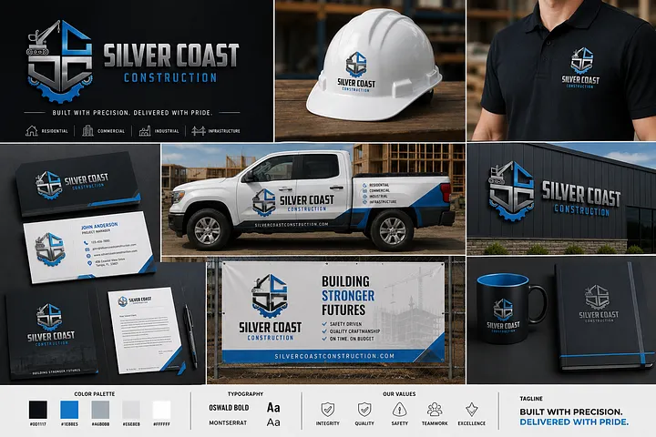
10. Silver Coast Construction – Industrial-Inspired Logo for Commercial Contractors
The Silver Coast Construction logo combines a geometric building-inspired monogram with industrial equipment elements, creating a strong visual identity for construction businesses. Its metallic silver, electric blue, and black color palette gives the design a modern, technical appearance while reinforcing precision and structural strength.
For U.S. commercial construction companies, industrial contractors, and infrastructure development firms, this logo style demonstrates how architectural geometry and industry-specific imagery can communicate expertise without relying on overly complicated illustrations.
The bold typography and compact emblem are particularly effective across contractor uniforms, hard hats, fleet vehicles, business cards, and commercial jobsite signage. The branding presentation shows how consistent colors and logo placement can create a recognizable identity across multiple customer touchpoints.
Design Inspiration: Industrial equipment symbolism, geometric architectural monogram, metallic silver finish, electric blue accents, and bold typography.
Best For: U.S. commercial contractors, industrial construction companies, infrastructure builders, and general contractors.
Branding Tip: Industrial construction logos should remain recognizable on large equipment and jobsite signage. Create a simplified flat-color version to ensure the design remains clear on embroidered uniforms, safety helmets, and smaller digital applications.
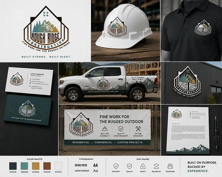
11. Rough Ridge Construction – Mountain-Inspired Logo for Custom Home Builders
The Rough Ridge Construction logo combines a residential roofline, mountain landscape, and pine trees within a structured badge-style composition. Its earthy green, charcoal, and warm brown color palette creates a rugged identity inspired by natural surroundings and outdoor craftsmanship.
For U.S. custom home builders, mountain property contractors, cabin construction companies, and residential remodeling businesses, this design illustrates how geographic character can become part of a memorable brand identity.
The logo is especially relevant as inspiration for construction businesses serving mountain and outdoor-oriented markets such as Colorado, Montana, Wyoming, and Idaho. Its badge-style structure gives it a traditional craftsmanship feel while maintaining a professional appearance across vehicle graphics, hard hats, uniforms, and construction signage.
Unlike minimalist architectural logos, this concept emphasizes location, craftsmanship, and the type of residential projects a contractor may specialize in.
Design Inspiration: Mountain landscape, residential roofline, pine trees, badge-style composition, and earthy natural colors.
Best For: U.S. custom home builders, cabin builders, residential remodeling contractors, and mountain property construction companies.
Branding Tip: Regional construction businesses can incorporate recognizable landscape elements into their branding. However, detailed mountain and tree illustrations should be simplified for small-scale applications such as embroidered clothing, website favicons, and social media profiles.
Best Colors for Construction Logos
Blue
Represents:
- Trust
- Professionalism
- Reliability
Popular among commercial contractors and engineering firms.
Orange
Represents:
- Energy
- Safety
- Visibility
Ideal for excavation and heavy equipment companies.
Black
Represents:
- Strength
- Luxury
- Authority
Often paired with gold or gray.
Gray
Represents:
- Concrete
- Steel
- Stability
Excellent for industrial branding.
Green
Represents:
- Sustainability
- Eco-friendly construction
- Landscaping
Construction Logo Mistakes to Avoid
Many contractor logos fail because they:
- Use outdated clip art
- Include too many colors
- Have poor typography
- Look blurry when resized
- Don’t work on dark backgrounds
- Don’t scale well for truck wraps
- Copy competitors
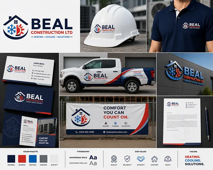
12. Beal Construction Ltd. — HVAC Heating & Cooling Contractor Logo
The Beal Construction logo integrates a residential roofline with recognizable heating and cooling symbols, including a blue snowflake and a red flame. This combination creates a clear visual connection to HVAC services while maintaining a structured construction brand identity.
Its navy blue, red, and light blue color palette provides strong contrast and visually represents both heating and cooling services. The bold typography makes the business name easy to identify across branded service vehicles, uniforms, hard hats, and outdoor signage.
For U.S. HVAC contractors, heating and air conditioning companies, and mechanical service providers, this design demonstrates how industry-specific symbols can communicate core services immediately.
The branding presentation also shows how a consistent visual identity can extend across service trucks, business cards, employee uniforms, and marketing materials—important applications for contractors serving residential and commercial customers.
Design Inspiration: Heating flame, cooling snowflake, residential roofline, bold typography, and contrasting red-blue colors.
Best For: U.S. HVAC contractors, heating and cooling companies, mechanical contractors, and residential climate-control service providers.
Branding Tip: HVAC logos should communicate heating and cooling services without becoming visually overcrowded. Keep the primary symbol simple enough to remain recognizable on service vans, embroidered uniforms, and mobile search results.
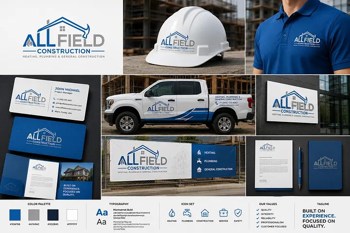
13. All Field Construction – Versatile Logo for Multi-Trade Contractors
The All Field Construction logo combines a modern roofline with bold typography and a subtle service-related symbol, creating a versatile identity for construction businesses offering multiple services.
Its blue, gray, and white color palette communicates professionalism, reliability, and technical expertise. The clean composition makes the logo suitable for businesses that provide heating, plumbing, general construction, and property improvement services under one brand.
For U.S. general contractors, multi-trade service providers, plumbing and HVAC businesses, and residential construction companies, this approach demonstrates how a flexible logo can represent several service categories without including too many individual trade symbols.
The design is presented consistently across service vehicles, contractor uniforms, hard hats, business cards, and outdoor banners. This unified presentation can help reinforce brand recognition across different service departments and customer interactions.
Design Inspiration: Modern roofline, integrated service symbol, bold geometric typography, and blue-gray branding.
Best For: U.S. general contractors, multi-trade construction businesses, plumbing and HVAC service providers, and residential property improvement companies.
Branding Tip: Contractors offering multiple services should avoid overcrowding their logos with separate icons for every trade. A recognizable primary symbol paired with clear service descriptions on vehicles and websites often provides a more flexible branding system.
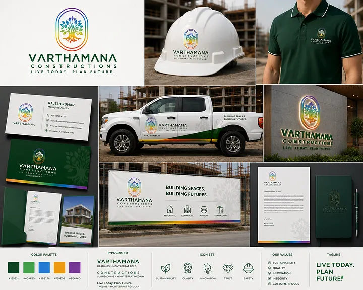
14. Varthamana Constructions – Nature-Inspired Logo for Sustainable Builders
The Varthamana Constructions logo features a colorful tree symbol with branching leaves and visible roots, enclosed within a rounded geometric frame. Its green, blue, orange, and purple accents create a distinctive identity inspired by growth, sustainability, and long-term development.
Unlike traditional construction logos that emphasize buildings, tools, or machinery, this concept uses nature-inspired imagery to communicate an environmentally conscious brand direction.
For U.S. sustainable construction companies, green home builders, eco-friendly residential contractors, and developers specializing in energy-efficient projects, this design offers inspiration for incorporating environmental themes into a professional brand identity.
The green typography reinforces the sustainability theme, while the multicolor emblem creates a recognizable visual element across company vehicles, uniforms, hard hats, stationery, and jobsite signage.
The overall design demonstrates how construction branding can communicate a company’s values and positioning rather than focusing exclusively on its services.
Design Inspiration: Nature-inspired tree emblem, visible roots, organic shapes, multicolor palette, and green typography.
Best For: U.S. sustainable builders, green construction companies, eco-friendly home builders, and energy-efficient residential developers.
Branding Tip: Sustainability-focused contractors can use natural colors and environmental symbols to communicate their positioning. However, environmental claims should be supported by actual building practices, certifications, or project experience rather than relying on visual branding alone.
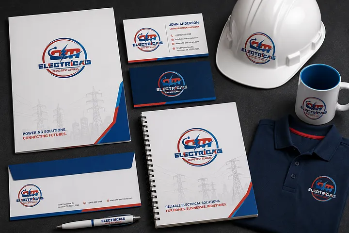
15. Electricals – Bold Electrical Contractor Logo with Lightning Symbol
The Electricals logo combines a dynamic lightning-inspired symbol with bold, italicized typography and a circular emblem. Its red, blue, and white color palette creates a high-energy identity that reflects electrical power, technical expertise, and dependable service.
For U.S. electrical contractors, commercial electricians, industrial electrical service providers, and residential wiring companies, this design demonstrates how a recognizable electrical symbol can communicate the nature of a business at first glance.
The circular composition helps the emblem work across contractor uniforms, safety helmets, business cards, equipment labels, and branded stationery. Its consistent appearance on both dark and light backgrounds provides flexibility for different marketing applications.
The overall design offers inspiration for electrical companies seeking a traditional industry-specific logo with a bold, recognizable visual presence.
Design Inspiration: Lightning-inspired icon, circular emblem, italicized typography, and red-blue color contrast.
Best For: U.S. electrical contractors, residential electricians, commercial electrical service companies, and industrial electrical businesses.
Branding Tip: Electrical contractor logos should remain recognizable from a distance, particularly on service vehicles and jobsite signage. A simplified lightning symbol can improve visibility when the full company name cannot be displayed prominently.
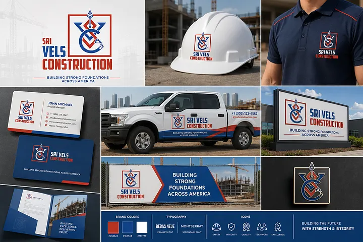
16. Sri Vels Construction – Geometric Construction Company Logo
The Sri Vels Construction logo features a distinctive geometric emblem built around angular shapes and an integrated construction-inspired symbol. Its red, navy blue, and white color palette creates a bold visual identity that communicates structural strength, precision, and professionalism.
The symmetrical composition gives the logo an organized appearance, while its sharp geometric lines reflect the technical nature of construction and engineering work.
For U.S. general contractors, commercial construction firms, structural contractors, and infrastructure companies, this design demonstrates how a custom emblem can establish a recognizable brand identity without relying entirely on traditional building illustrations.
The branding presentation shows the logo applied across construction vehicles, hard hats, company uniforms, outdoor signage, business cards, and stationery. These applications demonstrate how consistent branding can support recognition across jobsite and customer-facing environments.
Design Inspiration: Geometric emblem, angular construction-inspired shapes, bold typography, and red-navy color contrast.
Best For: U.S. general contractors, commercial builders, structural construction firms, and infrastructure contractors.
Branding Tip: Construction companies using detailed geometric emblems should test their logos at different sizes. A simplified version can help maintain clarity on embroidered uniforms, safety helmets, and mobile website headers.
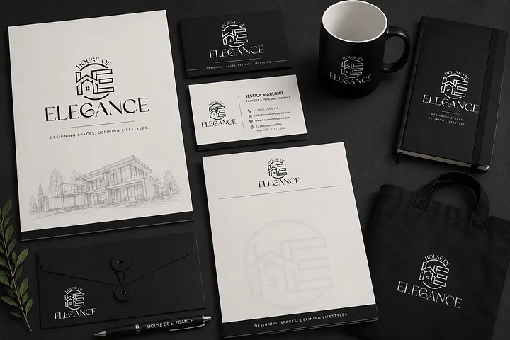
17. House of Elegance – Minimalist Logo for Luxury Interior Design and Remodeling
The House of Elegance logo combines a refined architectural illustration with elegant serif typography, creating a sophisticated visual identity inspired by premium interior design and residential spaces.
Its black-and-white color palette gives the design a timeless appearance, while the fine-line architectural symbol communicates attention to detail, craftsmanship, and design expertise.
For U.S. luxury interior design studios, high-end remodeling contractors, custom home renovation businesses, and residential design-build firms, this logo style demonstrates how understated typography and architectural elements can communicate premium positioning.
Unlike bold industrial construction logos, this concept emphasizes elegance and visual simplicity. The identity is particularly suitable for businesses serving homeowners who value architectural detail, custom finishes, and thoughtfully designed living spaces.
The logo is presented across stationery, business cards, folders, notebooks, and branded merchandise, showing how a restrained visual system can maintain consistency across client-facing materials.
Design Inspiration: Fine-line architectural illustration, elegant serif typography, monochromatic branding, and minimalist composition.
Best For: U.S. luxury interior designers, premium remodeling contractors, custom home renovation companies, and residential design-build studios.
Branding Tip: Luxury remodeling brands can benefit from restrained typography and minimal color palettes. However, detailed architectural linework should be simplified for smaller applications to maintain clarity across websites, social media profiles, and embroidered merchandise.
For luxury remodeling contractors and residential design-build firms, a refined logo is only the beginning of a premium brand experience. Consistent typography, project photography, proposal design, and website presentation help communicate the quality of a company’s work. Explore how a thoughtful contractor branding strategy can connect these elements into a recognizable identity.
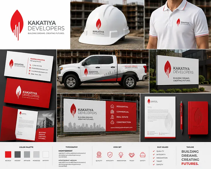
18. Kakatiya Developers – Modern Architectural Logo for Property Developers
The Kakatiya Developers logo features a bold red architectural symbol inspired by a flame-like shape with integrated vertical building elements. Its clean geometry creates a recognizable visual identity that reflects growth, development, and modern construction.
The red, gray, and white color palette provides strong contrast, while the minimalist typography maintains a professional appearance across both digital and printed applications.
For U.S. real estate developers, residential property development companies, commercial builders, and construction investment firms, this design demonstrates how a simplified architectural symbol can represent a company’s focus on creating and developing built environments.
The vertical emblem is particularly effective for building signage, construction site banners, business cards, branded vehicles, and marketing materials.
Its clean composition also makes the logo suitable for companies managing multiple development projects that require a consistent corporate identity.
Design Inspiration: Abstract architectural symbol, vertical building geometry, bold red accent, and minimalist typography.
Best For: U.S. real estate developers, residential development firms, commercial property builders, and construction development companies.
Branding Tip: Property development companies should prioritize logos that remain recognizable across project signage, sales presentations, and digital property marketing. A simple emblem can provide greater flexibility when branding multiple developments under one parent company.
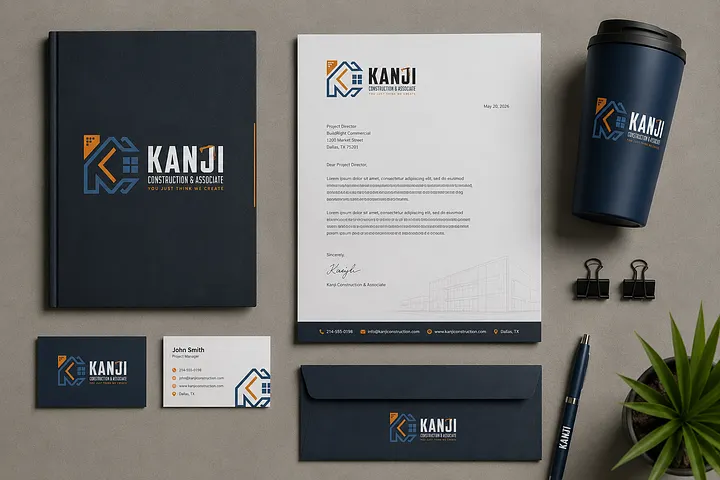
19. Kanji Construction & Associate – Architectural Monogram for Construction Consultants
The Kanji Construction & Associate logo combines stylized geometric letterforms with building-inspired elements to create a modern architectural monogram. Its navy blue, orange, and gray color palette gives the identity a structured and professional appearance.
The integrated architectural shapes communicate planning, technical precision, and construction expertise, making this style particularly relevant to businesses that provide consulting and project coordination services.
For U.S. construction consultants, project management companies, general contractors, and design-build firms, this design demonstrates how a custom monogram can communicate a professional identity without relying on detailed illustrations of tools or machinery.
The branding presentation extends across corporate folders, letterheads, business cards, envelopes, and office accessories. These applications are particularly relevant for construction businesses that regularly prepare project proposals, client presentations, and professional documentation.
Design Inspiration: Architectural lettermark, geometric construction elements, navy-orange color contrast, and modern corporate typography.
Best For: U.S. construction consulting firms, project management companies, design-build contractors, and general construction businesses.
Branding Tip: Construction consulting companies should consider how their logo appears on proposals, technical reports, and client presentations. A clean monogram paired with readable typography can help maintain a consistent professional identity across documentation and digital platforms.
For construction consultants and project management firms, professional branding should extend beyond business cards and proposal documents. A clear website that explains services, showcases completed projects, and highlights industry expertise can help prospective clients evaluate the company. Learn how contractor website design can support this process.
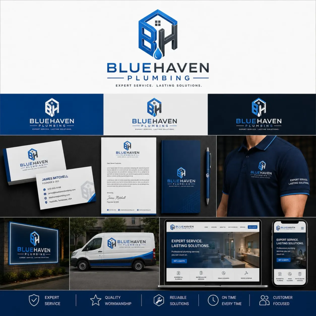
20. Bluehaven Plumbing – Modern House Monogram Logo for Residential Plumbing Contractors
The Bluehaven Plumbing logo combines the initials “B” and “H” with a geometric house outline and water droplet, creating a clean and recognizable identity for residential plumbing businesses. The integrated design communicates the company’s services without relying on complicated illustrations of plumbing tools.
Its blue, navy, and charcoal color palette reinforces the water-related nature of the business while maintaining a modern, professional appearance. The architectural structure of the monogram also gives the logo a distinctive identity that can work independently of the full company name.
For U.S. residential plumbing contractors, water heater installation companies, drain cleaning specialists, and plumbing repair businesses, this design demonstrates how a custom lettermark can connect a company’s initials with its primary services.
The branding presentation shows the logo applied across service vans, employee uniforms, business cards, outdoor signage, and a responsive plumbing website. These applications illustrate how a consistent identity can make a plumbing business recognizable across both local service areas and digital platforms.
Design Inspiration: BH lettermark, geometric house outline, water droplet, blue-navy color palette, and modern sans-serif typography.
Best For: U.S. residential plumbing contractors, plumbing repair companies, water heater specialists, and drain cleaning businesses.
Branding Tip: A plumbing logo should remain recognizable on service vans, uniforms, and mobile screens. Combining a simple water-related symbol with a custom monogram can create a distinctive identity without overcrowding the design.
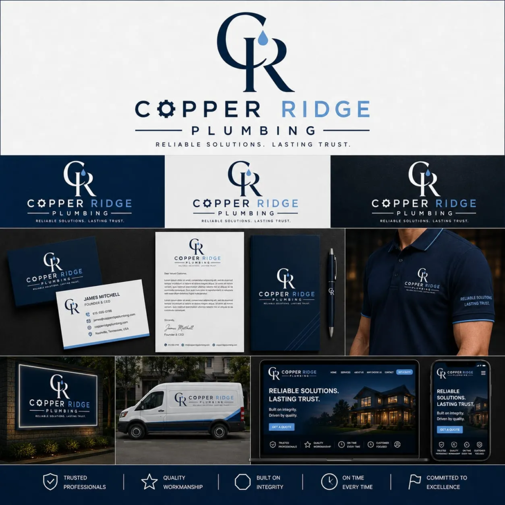
21. Copper Ridge Plumbing – Elegant Lettermark Logo for Premium Plumbing Services
The Copper Ridge Plumbing logo features an elegant “CR” monogram with a subtle water droplet integrated into the letterforms. Its refined typography and minimalist composition create a sophisticated visual identity that moves away from conventional plumbing logos featuring pipes, faucets, or plumbing tools.
The navy blue, light blue, and white color palette provides a clean, professional appearance. The contrast between the elegant monogram and modern business name creates a balanced identity suitable for residential plumbing companies seeking a more premium brand position.
For U.S. plumbing contractors specializing in luxury residential properties, bathroom renovations, high-end plumbing installations, and custom home projects, this design offers inspiration for building a brand that communicates professionalism and attention to detail.
The logo is presented across branded service vehicles, uniforms, stationery, business cards, outdoor signage, and a responsive website. Its minimalist structure helps maintain visual consistency across both digital and physical applications.
Design Inspiration: Elegant CR monogram, integrated water droplet, refined typography, minimalist composition, and navy-blue branding.
Best For: U.S. premium plumbing contractors, luxury residential plumbing companies, bathroom renovation specialists, and custom home plumbing installers.
Branding Tip: Plumbing companies targeting premium residential projects can use refined typography and restrained colors to create a more sophisticated identity. However, the monogram should remain readable on moving service vehicles and smaller applications such as embroidered uniforms.
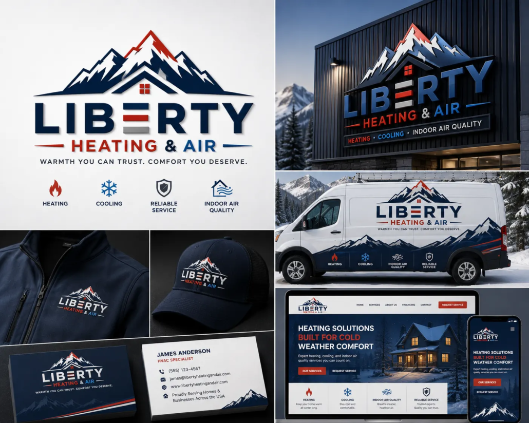
22. Liberty Heating & Air – Mountain-Inspired HVAC Logo for U.S. Heating and Cooling Contractors
The Liberty Heating & Air logo combines a bold mountain silhouette with a residential roofline and strong geometric typography. Its navy blue, red, and white color palette creates a distinctive identity that reflects reliability, outdoor conditions, and year-round indoor comfort.
The mountain imagery provides a recognizable regional character, making this design particularly relevant as inspiration for HVAC companies operating in colder or mountainous U.S. markets such as Colorado, Utah, Montana, and Wyoming.
Unlike conventional HVAC logos that rely entirely on flame and snowflake symbols, this concept uses geographic imagery to communicate the environment in which heating and cooling services are needed. The red accents reinforce the heating component, while the blue tones connect naturally with cooling and air conditioning services.
The branding presentation demonstrates how the logo can extend across HVAC service vans, employee jackets, embroidered caps, business cards, building signage, and a responsive contractor website.
For U.S. heating and cooling companies, this approach illustrates how regional identity and service-specific messaging can work together to create a recognizable local brand.
Design Inspiration: Mountain silhouette, residential roofline, geometric typography, navy-red contrast, and regional branding.
Best For: U.S. HVAC contractors, heating and air conditioning companies, mountain-region service providers, and residential climate-control specialists.
Branding Tip: HVAC contractors can incorporate regional elements into their logos to reflect the communities they serve. However, the design should remain clear and recognizable across service vehicles, uniforms, outdoor signage, and mobile websites.
Not Sure If Your Current Construction Brand Needs a Redesign?
You don’t necessarily need to replace everything. Sometimes the problem is the logo. Other times it’s inconsistent colors, typography, vehicle graphics, website presentation, or the lack of a complete brand system.
Start with a professional review of your existing identity and find out where your construction brand can be strengthened.
For U.S. residential plumbing contractors, a recognizable logo is just the beginning of building a professional brand. Consistent colors, service van graphics, employee uniforms, business cards, and website visuals help homeowners recognize the same company across different touchpoints. This consistency is particularly valuable for local plumbing businesses that rely on repeat customers, referrals, and neighborhood visibility.
Your Logo Is Only the Beginning
Your logo should be consistent across every customer touchpoint.
A complete construction brand identity includes:
- Logo
- Brand colors
- Typography
- Business cards
- Website
- Truck wraps
- Yard signs
- Email signature
- Proposal templates
- Social media graphics
- Safety apparel
- Equipment decals
Consistency makes your business easier to recognize and remember.
How Professional Branding Helps Contractors Win More Projects
Branding works best when potential customers can actually find your company online. Our Contractor SEO: The Complete Guide for U.S. Contractors (2026) covers important optimization and lead-generation elements for contractor websites. Strong branding can help your business:
- Build customer trust
- Increase referrals
- Improve online credibility
- Differentiate from competitors
- Support higher-value bids
- Strengthen long-term brand recognition
Frequently Asked Questions About U.S. Construction Logo Design
How much does a professional construction logo cost in the U.S.?
The cost of a professional construction logo in the United States varies depending on the designer or agency, project scope, and deliverables. A complete branding package should include scalable vector files (AI, EPS, SVG, PDF), color variations, logo usage guidelines, and versions optimized for trucks, job site signage, uniforms, websites, and social media. Investing in a professionally designed logo helps U.S. contractors build credibility and maintain a consistent brand identity across every customer touchpoint.
Which colors work best for U.S. construction company logos?
Blue, orange, gray, black, and green remain the most trusted colors for U.S. construction companies. Blue represents trust and professionalism, orange symbolizes safety and energy, gray reflects concrete and steel, black conveys strength and authority, while green is commonly used by sustainable builders and environmentally conscious construction firms.
Should a U.S. construction company logo include a house icon?
Not always. While home builders and residential contractors often use house symbols, many U.S. commercial contractors prefer architectural lines, geometric shapes, steel structures, cranes, shields, or abstract building icons. The best logo should reflect your specific construction niche rather than relying on generic clip art.
Can AI create a professional construction logo for my business?
AI can quickly generate logo concepts and provide creative inspiration, but most U.S. construction companies benefit from professional refinement. An experienced branding designer ensures the logo is unique, scalable, legally distinguishable, and suitable for vehicle wraps, safety helmets, uniforms, business cards, websites, proposals, and large-format signage.
How often should a U.S. construction company update its logo?
Most established U.S. construction companies do not need a complete redesign unless their branding looks outdated, no longer represents their services, or has become inconsistent across marketing materials. A modern brand refresh every 8–15 years is often enough to maintain a professional appearance while preserving brand recognition.
What file formats should a U.S. contractor receive with a professional logo?
A professional logo package should include AI, EPS, SVG, PDF, PNG, and JPG files, along with black, white, and full-color versions. These formats ensure the logo can be used on construction vehicles, hard hats, safety vests, uniforms, business cards, websites, job site banners, and large outdoor signage without losing quality.
Why is consistent branding important for U.S. construction companies?
Consistent branding helps U.S. contractors build trust, improve recognition, and present a professional image across every customer interaction. Using the same logo, colors, typography, and visual identity on trucks, uniforms, proposals, websites, and job site signs creates a stronger brand that customers remember and are more likely to recommend.
Does a professional logo help U.S. contractors win more projects?
A professional logo alone won’t guarantee more contracts, but it contributes to a stronger first impression. Combined with quality workmanship, positive reviews, a professional website, and consistent branding, it can increase customer confidence and help your business stand out in a competitive market.
What makes a great logo for a U.S. construction company?
A great construction logo is simple, memorable, scalable, and relevant to the company’s services. It should reproduce clearly on vehicles, uniforms, equipment, websites, and signage while conveying professionalism, reliability, safety, and craftsmanship.
A professionally designed logo is more than a graphic — it represents your company’s reputation, craftsmanship, and commitment to quality. Combined with consistent branding across your website, vehicles, uniforms, and marketing materials, it helps create a strong first impression that can lead to more inquiries and long-term recognition.
Whether you’re launching a new contracting business or updating an established brand, investing in a thoughtful visual identity is a practical step toward building credibility in a competitive market.
Continue Reading: U.S. Construction Branding Guides
Contractor SEO: The Complete Guide for U.S. Contractors (2026)
Local SEO for Contractors: How to Rank Higher on Google Maps in 2026
15 Best Contractor Website Examples for 2026
Contractor Website Redesign: 12 Signs Your Website Is Costing You Leads
How Much Does a Contractor Website Cost in 2026? U.S. Pricing Guide
Ready to Build a Construction Brand That Wins More Projects?
Whether you’re launching a new construction company or refreshing an established business, a professional identity should help your company look credible, consistent, and recognizable everywhere customers encounter it.
I create custom logo and brand identity systems for U.S. contractors designed for real-world use — from vehicles and uniforms to websites, proposals, signage, and marketing materials.
Already have a logo? Start with a free brand audit to see how your current identity can be improved.
Are you a contractor, builder, or home service business owner?
What did you pay for your website—and looking back, was it worth the investment?If you’re currently comparing website quotes, you can also share what you’re being quoted and what’s included. Your experience may help other contractors make a better decision.
Comments are welcome from contractors, builders, construction professionals, and business owners. Please keep the discussion relevant and avoid promotional links or spam.
 Unitmask.cloud
Leave a Reply
Want to join the discussion?Feel free to contribute!